Reading nutrition intake
Trends → Nutrition compares what the child actually ate against the targets set for them. It is usually the fastest read in the tab.
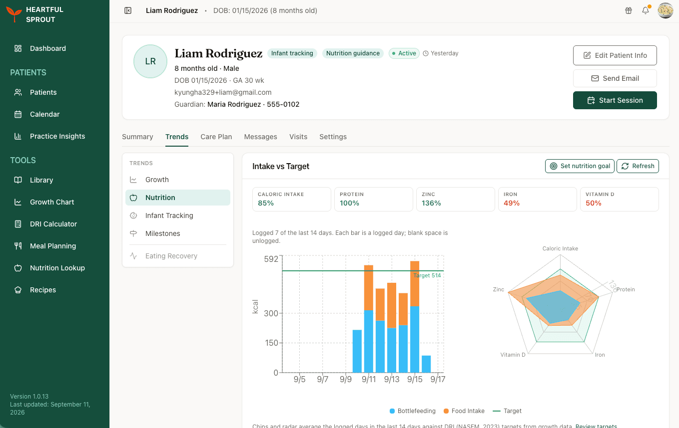
Intake vs Target
The card has three views of the same data, and they answer different questions.
| View | Answers |
|---|---|
| Tiles | Which nutrient is short, at a glance. Each shows the percentage of target reached and is colour-coded |
| Bar chart | Whether intake is consistent day to day, plotted against the target line and split into bottlefeeding and food intake |
| Radar | The overall shape of the diet, averaged across logged days. Which nutrients appear is set by the nutrition goal, see below |
Which nutrients are shown
Until you set a nutrition goal for the patient, the radar plots a default set: calories, protein, iron, vitamin D, zinc, and dietary fibre.
Set a nutrition goal with priority nutrients and the radar switches to those instead, with calories always kept as the first axis. So if you are working a case on iron and vitamin D, you can narrow the chart to the nutrients you are actually managing rather than reading around the default six.
Every axis on the radar is a percentage of target, so a nutrient with no target value cannot be drawn and is left off the chart rather than shown sitting at zero.
Where the targets come from
Targets are DRI values (NASEM, 2023) applied to the child's own growth data, so they move as the child grows. Use Set nutrition goal to override them for a patient whose needs differ, and Review targets to see what is currently being applied. See Setting a nutrition goal.
How the averages are calculated
The window is the last 14 days, but no figure on the card is divided by 14.
- The bar chart plots one bar per logged day. Blank space is a day with no log, not a day of zero intake.
- The tiles and the radar average across days the family logged, so a fortnight with seven logged days is averaged over seven.
- More precisely, each nutrient is averaged over the days that nutrient was recorded. A child who ate iron-rich food on two days out of seven has their iron averaged over those two days, not over the seven.
The practical effect is that sparse logging pushes averages up, because the empty days never dilute them. A tile reading 49% of the iron target on two logged days is a weaker signal than the same number across twelve.
Read the logged-days caption before you act on any figure on this card.
What to look for
- A nutrient sitting well under target across most logged days, rather than on one bad day
- Wide day-to-day swings, which often point to feeding difficulty rather than diet composition
- Intake that tracks fine while growth does not, or the reverse
- Food reaction notes logged alongside meals. See Food intro & allergens
Food introduction & allergens
Patient-logged solids introduction, visible in two places on the patient record.
What you see
| Location | Contents |
|---|---|
| Trends → Infant Tracking (Food Intro card) | "Foods introduced" and "Mastered" counts, allergens introduced, and first-tried dates |
| Trends → Nutrition (Food Introduction table) | Per-food Attempted At and Mastered At dates |
The richer per-food experience (food ladder, per-meal reactions) lives in the family's app; your record shows the clinical trail of what's been tried and mastered.
Reaction logs
Families log reactions in Heartful Sprout under Health → Reaction Notes: date, symptoms from a picker, and a free-text note. These surface on the Food Reaction Notes card under Trends → Nutrition. See Documenting a food reaction for the workflow.
For an early allergen-introduction case, scan the allergens-introduced list for missing top-9 allergens and prompt during the next visit.